Trendlines & Interval Detection
Automatically detect or manually define effort intervals to break tests into clear, analyzable segments.
Smoother Patterns with Trendline View
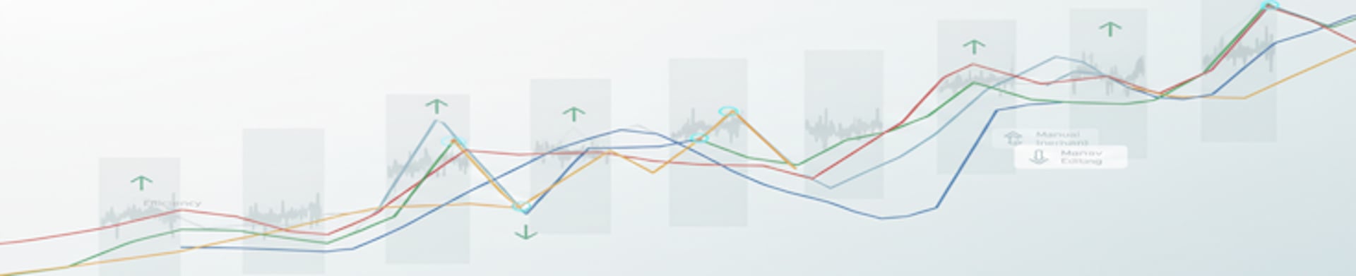
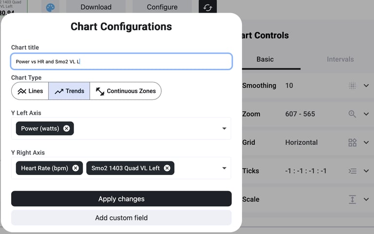
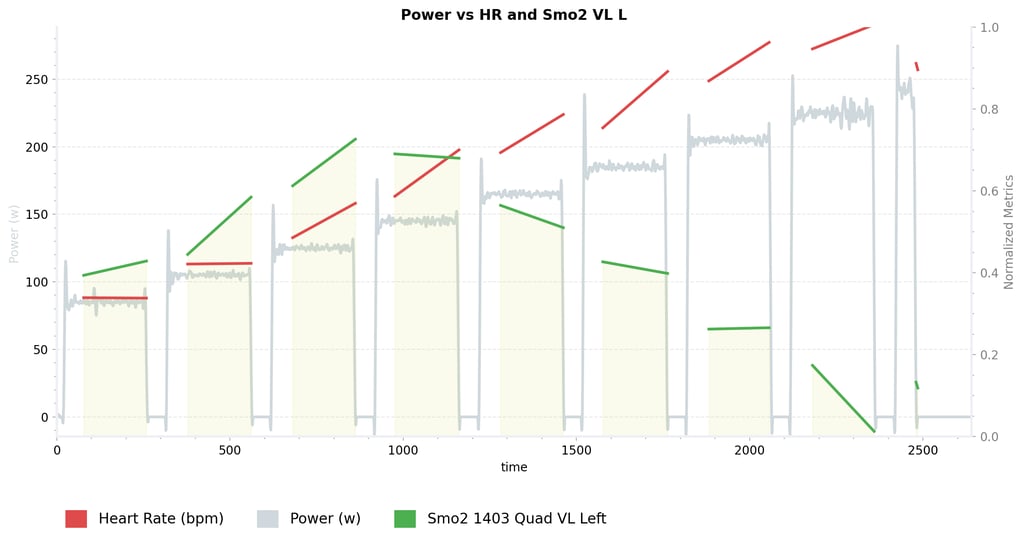
Assess.Works lets you instantly switch any chart to a Trendline view for a smoother, cleaner visual. Instead of jagged raw data, you see smoothed lines that make patterns easier to read. These trendlines help reveal important insights that might get lost in noisy data–like when a metric suddenly flatlines, changes slope, or when a breakpoint occurs–helping you identify how your body responds as load increases or spot signs of fatigue build up over time
Trendlines and intervals are designed to work together seamlessly. Once intervals are set, the system calculates separate trend lines within each interval segment. In practice, this means you can see how each metric is trending during each work bout or rest. For example, you might find that in early intervals your heart rate climbs steadily, but in later intervals it plateaus – or that muscle oxygen (SmO2) trends downward faster as fatigue sets in. By breaking the data into interval segments, you isolate different physiological reactions. It becomes much easier to pinpoint when a change happened and under what conditions, instead of trying to interpret a single long continuous line.

All these tools save you time and effort compared to old-school spreadsheets or static charts. Instead of manually smoothing data or guessing where to split intervals, you get an instant, interactive view. The smooth trendlines help you spot subtle changes faster – for instance, a slight dip or leveling off that indicates a threshold – without the distraction of raw noise
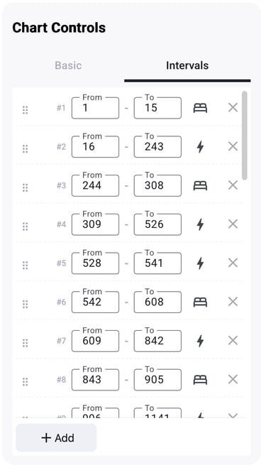
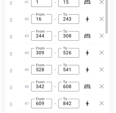
For certain structured tests (like ramp or step protocols), Assess.Works automatically detects your work and rest intervals as soon as you upload the data. The system uses a smart algorithm (with data cleaning and a “state machine”) to reliably find each phase. In practice, you don’t have to manually mark out stages in a ramp test – it’s done for you. Each detected interval is clearly defined, so you can immediately see the segmented stages of effort and recovery. This gives context to the trendlines – you can tell which changes happened during work bouts and which during rests at a glance.
Built for Future Insights
Trendlines and interval detection aren’t just convenient now – they’re the foundation for even smarter analysis coming soon. By structuring data into clear segments with trends, the platform sets the stage for upcoming AI-driven features. For example, the system will be able to automatically cluster similar response patterns across your workouts or flag outlier segments. Even more exciting, Assess.Works is working on limiter detection–using these trends to identify what’s holding an athlete back. Because the trends show how different systems behave in each interval (for example, how oxygen saturation vs. heart rate changes), future updates will analyze those patterns to pinpoint likely performance limiters. In short, the insights you get today will only grow deeper as new AI tools build on this trendline and interval foundation.
Trendlines aren’t rocket science—and yes, most tools offer some form of smoothing. But what makes it different is how seamlessly it’s built in. As soon as you import a file, trendlines are automatically calculated and ready to use—no setup, no extra clicks. In many cases, it’s as simple as switching the view to instantly gain a clearer perspective, without diving into complex configurations or formulas.
© 2025. All rights reserved.
Resources
Blog
Support
Company
Performance efficiency
Efficiency Metrics
Onboarding Call Booking